

As a website publisher, aspects such as content, architecture and design fall under your responsibility. And yet, even if you implement all of the optimisations and best practices, the browsing habits of your users is out of your hands (particularly when it comes to devices and networks).
We explore the risks associated with JavaScript in terms of loading times on low-end mobiles, drawing upon the experience of web performance expert and consultant Jean-Pierre Vincent.
The thorny issue of loading times on low-end mobiles
“An excess of JavaScript will significantly hamper the browsing experience on a mobile website, and I find that nobody thinks to check performance levels across all devices – especially those at the lower end of the spectrum. The problem is that these are the first to get blocked if the JS isn’t optimised”, laments Jean-Pierre Vincent.
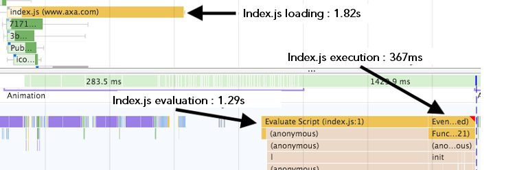
Appointed to improve the loading times and UX on an insurance website, one of the consultant’s main priorities was JS optimisation. The bundle (all of the JS files) amounted to 1.3 MB to load (1.82 s on a Galaxy Note 3 using 4G) and 4.2 MB to execute (1.29 s to parse + 367 ms to execute).
Knowing your users: tell me your device, I’ll tell you how you browse
Upstream of the optimisation process, the website’s mobile user base was carefully studied in order to understand the most representative browsing conditions.
“This study revealed that, while 51% of all visitors had an iPhone or iPad, 30% used low-end smartphones – which included some very old models. That’s a large proportion of traffic for whom we had to make the browsing experience as smooth as possible!” adds Jean-Pierre Vincent.
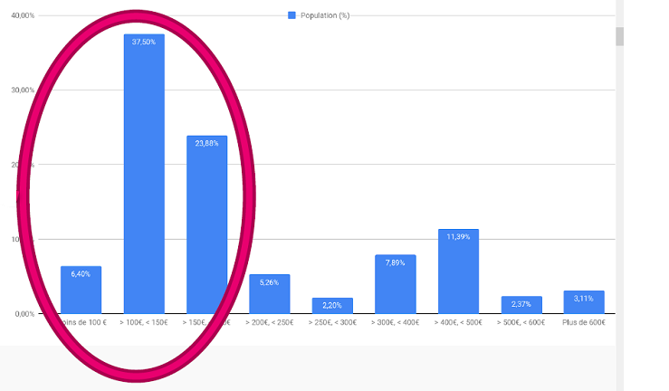
Distribution of visitors by device price (excluding iPhone / iPad)
In light of this data, the JS files would be optimised in two stages.
JavaScript: Operation “Trim and Divide”
PHASE 1: TRIM THE FAT
An analysis of the JS bundle would pinpoint the specific areas for improvement.
Among others, these were the measures used to trim away this ‘excess fat’: the SVGs were removed from the bundle (and no longer loaded on mobile), the build was run in “production” mode to enable other optimisations in libraries (such as React), while the build tools and the 10 heaviest dependencies were updated and subsequently optimised (Babel, Polyfill, coreJS, momentJS, D3, GSAP, Ramda, Request, etc.).
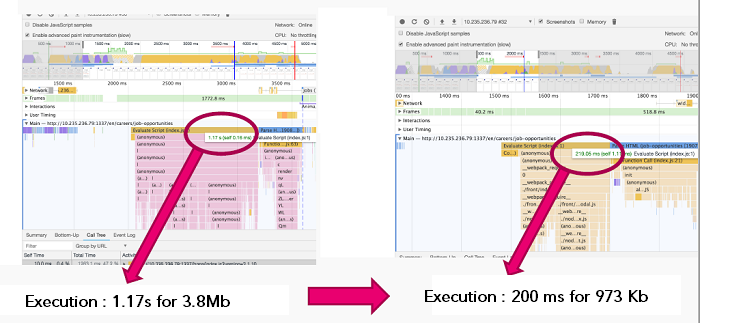
“On a Samsung Galaxy Note 3, the files went from 3.8 MB with an execution time of 1.17 s to 973 KB with an execution time of 200 ms!” explains Jean-Pierre Vincent.
PHASE 2: DIVIDE AND CONQUER
The second stage consisted of dividing up the files to load them even faster. At first, there was only one bundle per page/route and per module.
With the divided bundles, each page now contained between 2 and 4 times more files; however, these were 2 to 4 four times lighter as a whole.
This reduced the parsing time by a factor of 2 or even 3, therefore, the code executed that much faster. Let’s take the example of a React page before and after the optimisation process, based on a mobile connection in India. A comparison was drawn between the times taken to display the cookie banner, as these indicated that the scripts had finished executing on the page: the React modules in the background displayed 2 times faster than before (in every country).
It’s worth the effort to optimise your JS – in terms of both your mobile performance and your marketing and business performance.
For instance, below is the variation in turnover achieved by one of our clients on their online store after having optimised the JS files, distributed by operating system. The bars represent turnover during the 2019 sales period, and the vertical lines indicate the previous year’s turnover, i.e. before optimisation.
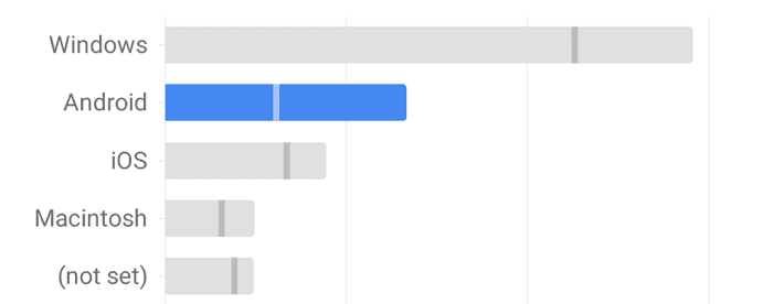
Performance and UX on Android smartphones improved to such a degree, thanks to optimisation, that turnover more than doubled from one year to the next – overtaking iOS by some distance!
In conclusion, if you want to implement effective optimisations, you first have to answer the following questions about your user base: Which smartphones? What type of connection?
Above all, remember to test your optimisations on the devices that your users actually carry, which are not necessarily high-end models.
This case study is taken from a web performance presentation by Jean-Pierre Vincent in 2019, available here in PDF (and in video chapters, in French). Also discussed in the presentation are:
- Font optimisation: formatting in EOT, WOFF and WOFF2, subsetting, hosting and display strategy;
- Compressing images and videos: formats (JPG, SVG, PNG, GIF, etc.) and types of compression, on-demand loading and responsive loading;
- Third parties: A/B testing, dependencies, ads and trackers, etc., and how to include them;
- HTTP/2: from theory to practice, push messaging and optimisation choices.
Would you like to learn more about web performance
and how Fasterize can help you automate smart optimisations?
